With React Native you can style your components with CSS-like styles. Style names and values usually match CSS styles, except names are written like backgroundColor instead of like background-color.
Not all of the CSS styles are supported. You can find a list of supported styles in React Native Documentation.
Table of contents
What is CSS?
Cascading Style Sheets (CSS) is a style sheet language used for describing the presentation of a document written in a markup language. It’s primarily used on the web.
Defining Styles in React Native
To define styles you need to import StyleSheet component from react-native module first.
import { StyleSheet } from 'react-native';
And define them as following.
const styles = StyleSheet.create({
  text: {
    textAlign: 'center',
    color: '#EEEEEE',
    marginBottom: 5,
  },
  important: {
    color: 'red',
    fontWeight: 'bold',
  },
});
We defined two styles: text and important with various CSS-like styles.
Apply Styles to Components
To apply styles to any React Native core component you just need to pass it as a prop named style.
<Text style={styles.header}>
  Welcome to Amazing App!
</Text>
You can also pass an array of styles – the last style in the array has precedence, so you can use this to inherit styles.
<Text style={[styles.text, styles.important]}>
  That's an important text
</Text>
And you can even pass a plain JavaScript object with styles. But, it can get messy when your app gets bigger, and it’s recommended to use StyleSheet.create and predefined styles instead.
<Text style={{
  color: 'red',
  fontWeight: 'bold',
}}>
  Welcome to Amazing App!
</Text>
Example App
Let’s create a new app to see in action what we’ve learned so far.
Open Terminal App and run these commands to initialize a new project and run it in an emulator.
react-native init LearnignStyles;
cd LearnignStyles;
react-native run-ios;
Once your app is up and running, press ⌘D and select Enable Hot Reloading. This will save you some time having to reload the app manually every time you make a change.
Open index.ios.js file and change its content with the following code.
import React, { Component } from 'react';
import {
  AppRegistry,
  StyleSheet,
  Text,
  View
} from 'react-native';

class LearnignStyles extends Component {
  render() {
    return (
      <View style={styles.container}>
        <Text style={styles.header}>
          Welcome to Amazing App!
        </Text>
        <Text style={styles.text}>
          That's a regular text
        </Text>
        <Text style={[styles.text, styles.important]}>
          That's an important text
        </Text>
        <View style={styles.buttonWrapper}>
          <Text style={styles.button}>Great</Text>
        </View>
      </View>
    );
  }
}

const styles = StyleSheet.create({
  container: {
    flex: 1,
    justifyContent: 'center',
    alignItems: 'center',
    backgroundColor: '#FCBF2E',
  },
  header: {
    color: '#FFFFFF',
    fontSize: 20,
    textAlign: 'center',
    margin: 10,
  },
  text: {
    textAlign: 'center',
    color: '#333333',
    marginBottom: 5,
  },
  important: {
    color: '#FB572F',
    fontWeight: 'bold',
  },
  buttonWrapper: {
    backgroundColor: '#FB572F',
    marginTop: 30,
    padding: 20,
  },
  button: {
    color: '#FFFFFF',
  },
});

AppRegistry.registerComponent('LearnignStyles', () => LearnignStyles);
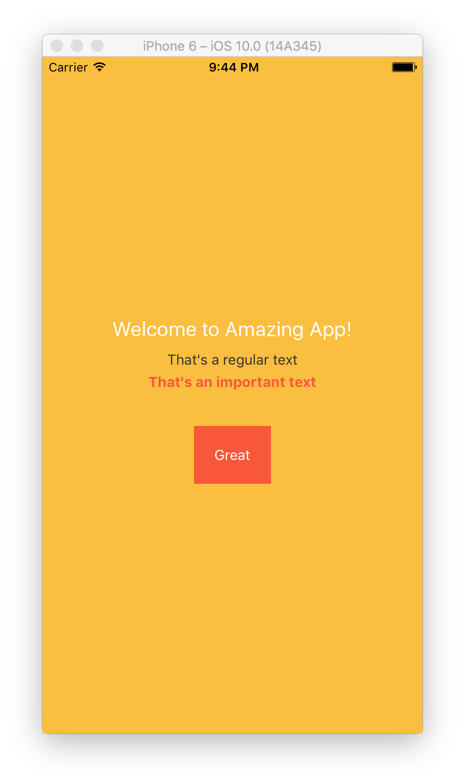
First, we defined a View component with styles.container style in render method, and added a few Text components inside it. We also added a View for a button.
<View style={styles.container}>
  <Text style={styles.header}>
    Welcome to Amazing App!
  </Text>
  <Text style={styles.text}>
    That's a regular text
  </Text>
  <Text style={[styles.text, styles.important]}>
    That's an important text
  </Text>
  <View style={styles.buttonWrapper}>
    <Text style={styles.button}>Great</Text>
  </View>
</View>
Next, we defined all of our app styles in styles constant using StyleSheet.create.
const styles = StyleSheet.create({
  ...
});
Let’s go through each style and see what it does.
First one is container. It styles the main component to be flexible, which means it will take all of the screen space. It also sets it to align its children at the center of the screen with justifyContent and alignItems styles.
  container: {
    flex: 1, // take all available screen space
    justifyContent: 'center', // center children vertically
    alignItems: 'center', // center children horizontally
    backgroundColor: '#FCBF2E', // set background color
  },
Next one is header, which styles the header.
  header: {
    color: '#FFFFFF', // white color
    fontSize: 20, // set a bigger font size
    textAlign: 'center', // align at the center
    margin: 10, // add margin around text
  },
Next, comes text to style regular text.
  text: {
    textAlign: 'center', // align at the center
    color: '#333333', // dark gray color
    marginBottom: 5, // add margin at the bottom
  },
And important style overrides color and font weight of text style, but keeps marginBottom and textAlign.
  important: {
    color: '#FB572F', // red color
    fontWeight: 'bold', // bold font weight
  },
Since, we’re using it together with
styles.textstyle in an array<Text style={[styles.text, styles.important]}>, andstyles.importantcomes afterstyles.text, it overrides styles, that are already exist instyles.textstyle, but keeps other styles that are not.
Next, buttonWrapper styles our button with a background color and some margins and paddings.
  buttonWrapper: {
    backgroundColor: '#FB572F', // orange background
    marginTop: 30, // add margin at the top
    padding: 20, // add padding inside button
  },
And lastly, button sets button text color to white.
  button: {
    color: '#FFFFFF', // white color
  },
I hope you enjoyed the tutorial. Subscribe to find out about new tutorials and learn how to build amazing apps!


Pingback: Complete Guide to Mobile App Onboarding with React Native | Rational App Development()
Pingback: Universal Tab Bar in React Native | Rational App Development()