You can position any components anywhere on the screen using Flexbox. You can arrange them vertically, horizontally, center them, distribute evenly and much more.
Table of contents
What is Flexbox?
The CSS3 Flexible Box, or Flexbox, is a layout mode providing for the arrangement of elements on a page such that the elements behave predictably when the page layout must accommodate different screen sizes and different display devices.
Let’s Get Started
Let’s start by creating a new app. Open Terminal App and run these commands to initialize a new project and run it in emulator.
react-native init LearnignFlexbox;
cd LearnignFlexbox;
react-native run-ios;
Once your app is up and running, press ⌘D and select Enable Hot Reloading. This will save you some time having to reload the app manually every time you make a change.
Open index.ios.js file and change its content with the following code.
import React, { Component } from 'react';
import {
  AppRegistry,
  StyleSheet,
  Text,
  View
} from 'react-native';

class LearnignFlexbox extends Component {
  render() {
    return (
      <View style={styles.container}>
        <View style={styles.navBar}>
          <Text style={styles.navBarButton}>Back</Text>
          <Text style={styles.navBarHeader}>Awesome App</Text>
          <Text style={styles.navBarButton}>More</Text>
        </View>
        <View style={styles.content}>
          <Text style={styles.text}>
            Welcome to Awesome App!
          </Text>
        </View>
      </View>
    );
  }
}

const styles = StyleSheet.create({

});

AppRegistry.registerComponent('LearnignFlexbox', () => LearnignFlexbox);
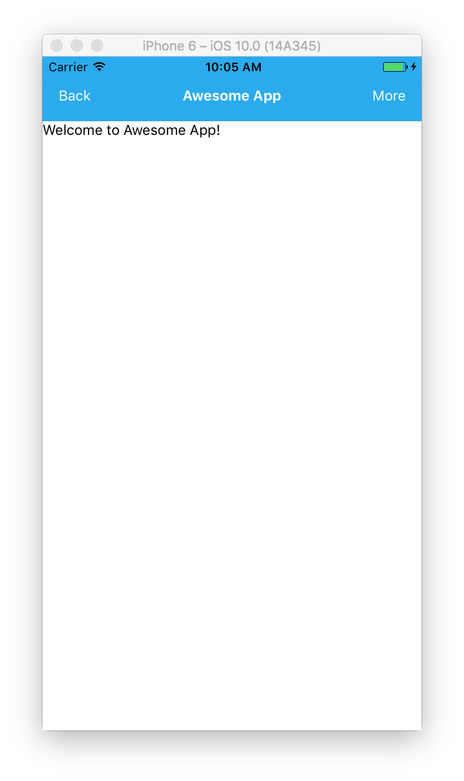
As you can see, we have a View component with container style and two more Views inside it, navBar and content. navBar has 3 Text components with either navBarButton style for button on left and right or navBarHeader style for the header. And, lastly, content View has Text inside.
Ok, let’s take at look at our progress so far.
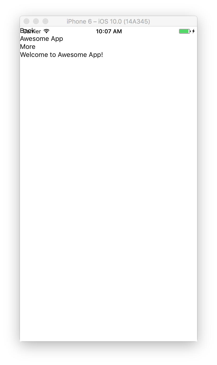
Doesn’t look that great, huh? That’s because we haven’t defined any of those styles mentioned yet. By default all of the components are vertically stacked on top of each other.
Defining Styles
Let’s start adding our styles inside styles definition we added earlier.
const styles = StyleSheet.create({

});
Main Flexible Container
First, let’s add container style
  container: {
    flex: 1,
  },
flex: 1 means that container is flexible and will take up all of the space on the screen. Nothing has changed on the screen, because container has white background.
Understanding Flexible Containers
To illustrate how that works let’s take a look at quick example here. Let’s change container background and try setting flex to ether 0 or 1.
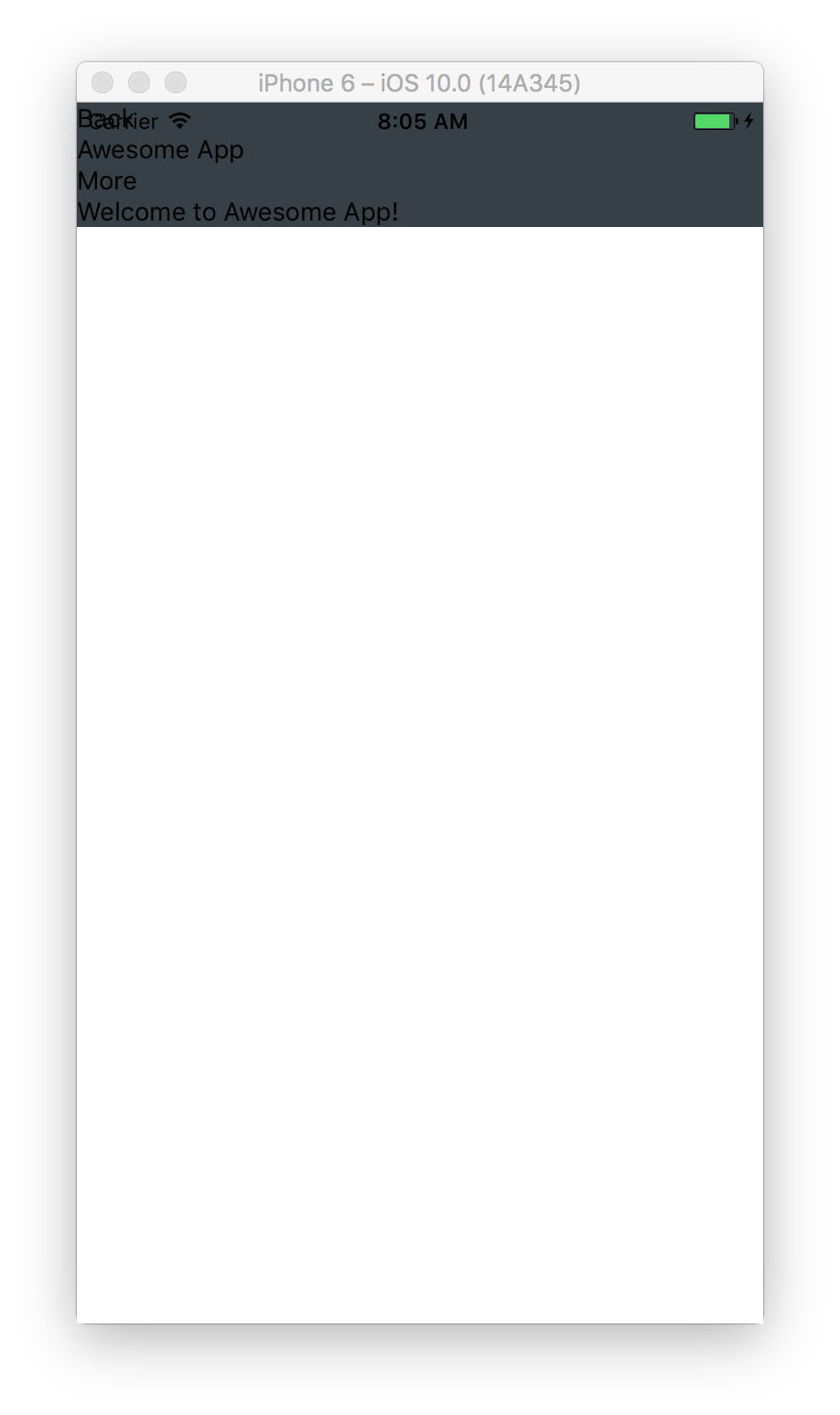
container: {
  flex: 0,
  backgroundColor: '#374046'
},
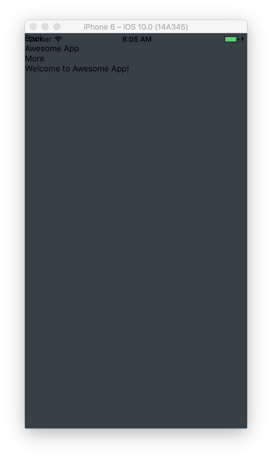
container: {
  flex: 1,
  backgroundColor: '#374046'
},
Container on the left has flex set to 0 and it takes as much space as all of its children take. In contrast, container on the right has flex set to 1 and takes all of the available space on the screen.
Let’s add a nav bar at the top of the screen. Add navBar style
  navBar: {
    flexDirection: 'row',
    paddingTop: 30,
    height: 64,
    backgroundColor: '#1EAAF1'
  },
We set total height to 64 and paddingTop to 30 to push it down from status bar. And we set flexDirection to row, which means that all of the navBar children components will be stacked horizontally instead of vertically. By default flexDirection is column and children are stacked vertically.
Let’s see where are we at.
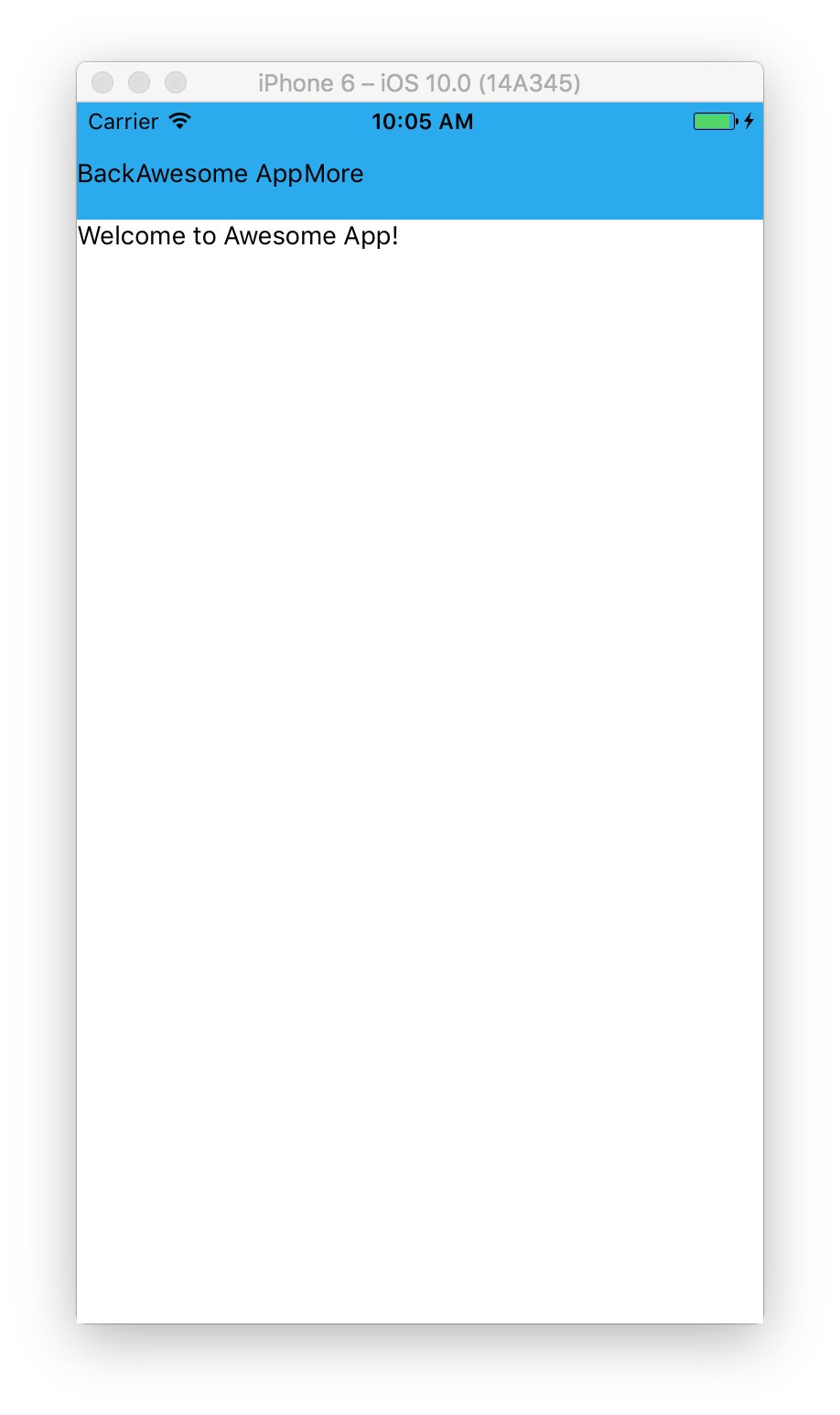
Looks better, but we want to have buttons aligned on the sides and header centered. So, let’s add styles to do that.
  navBarButton: {
    color: '#FFFFFF',
    textAlign:'center',
    width: 64
  },
  navBarHeader: {
    flex: 1,
    color: '#FFFFFF',
    fontWeight: 'bold',
    textAlign: 'center'
  },
We set width to 64 for buttons, and flex to 1 for the header, which means that it will take all of the space available between buttons.
Looks much better.
Center Content Vertically and Horizontally
Next, we want to center welcome text on the screen. Let’s add some styles for content and text containers.
  content: {
    flex: 1,
    justifyContent: 'center',
    alignItems: 'center',
    backgroundColor: '#374046'
  },
  text: {
    color: '#EEEEEE'
  },
We set flex to 1 to take all available screen space, justifyContent to center to center children components vertically and alignItems to center to center horizontally.
When you switch
flexDirectiontorowmodejustifyContentandalignItemswork the opposite way.justifyContentgets responsible for aligning children components horizontally andalignItemsvertically.
Let’s check out how is out app looking so far.
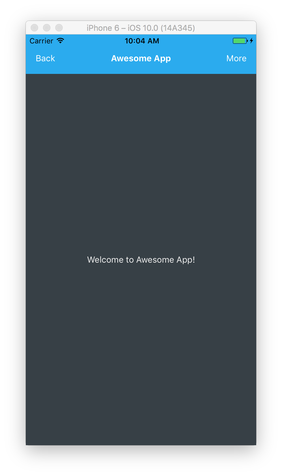
Looks pretty good.
Tab Bar
Now, let’s add tab bar at the bottom. Just add new View after <View style={styles.content}> closing </View> tag.
<View style={styles.content}>
  <Text style={styles.text}>
    Welcome to Awesome App!
  </Text>
</View>
// Add the following
<View style={styles.tabBar}>
  <View style={[styles.tabBarButton, styles.button1]} />
  <View style={[styles.tabBarButton, styles.button2]} />
  <View style={[styles.tabBarButton, styles.button3]} />
  <View style={[styles.tabBarButton, styles.button4]} />
  <View style={[styles.tabBarButton, styles.button5]} />
</View>
We added View with tabBar style and 5 children View components for buttons. Each button uses two styles, first is tabBarButton, which is the same for all buttons and unique styles button1 through button5 for each button.
When you want to use more than one style for a component you can use and array
[]of stylesstyle={[styles.tabBarButton, styles.button1]}with as many comma separated styles as you wish.
And let’s define the styles
  tabBar: {
    height: 50
  },
  tabBarButton: {
    flex: 1
  },
  button1: { backgroundColor: '#8BC051' },
  button2: { backgroundColor: '#CCD948' },
  button3: { backgroundColor: '#FDE84D' },
  button4: { backgroundColor: '#FCBF2E' },
  button5: { backgroundColor: '#FC9626' }
We defined fixed height for tabBar, and set flex to 1 for tabBarButton, which means that each button will take as much space as available equally. And we also defined unique color for each button.
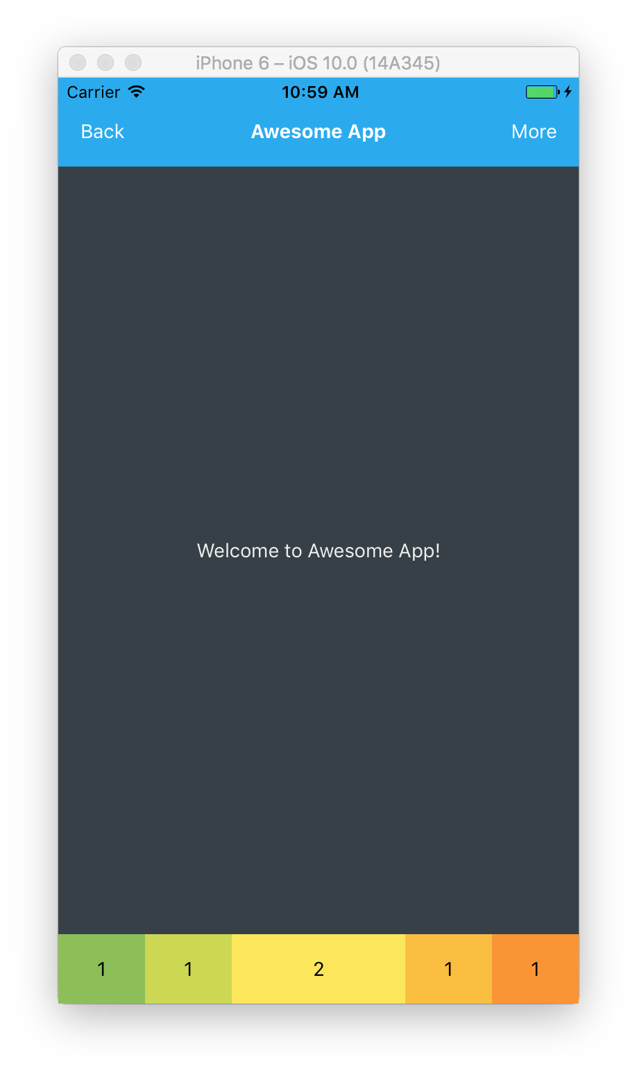
Let’s see how does that look.
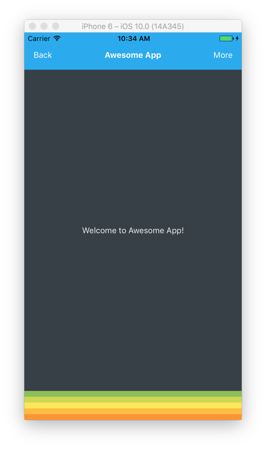
Oops, all of our buttons got stacked vertically, which is default behavior, but not what we wanted. Let’s set flexDirection to row in order to stack buttons horizontally.
  tabBar: {
    flexDirection: 'row',
    height: 50
  },
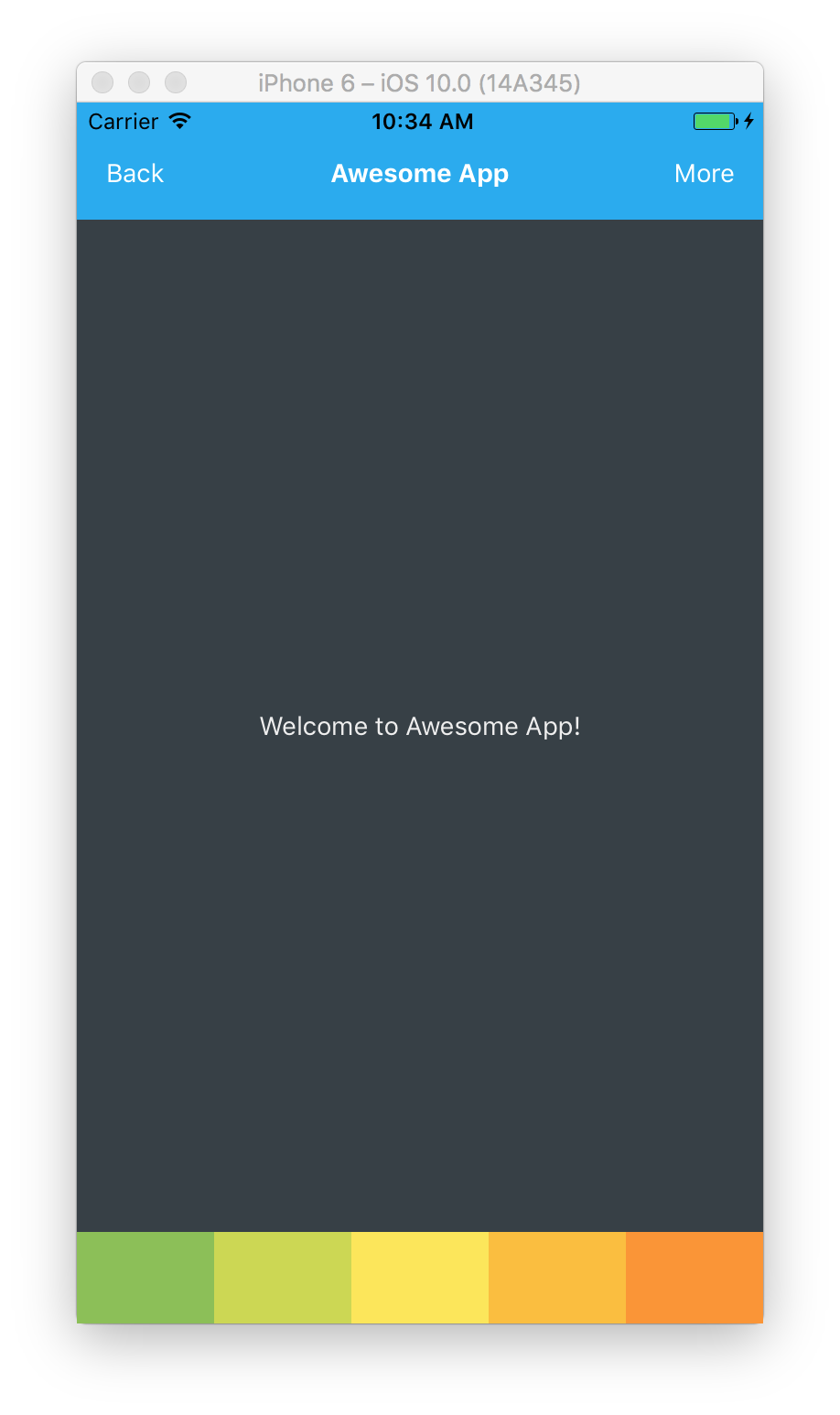
Ok, now it perfect.
Understanding Flex
When we set flex to 1 for each button, that means each button will take as much space is available and all of then will take the same amount of space. If we wanted 3rd button to be as twice as big as other buttons we could set its flex value to 2.
button3: { flex: 2, backgroundColor: '#FDE84D' },
And then it will look like
Understanding Aligning Containers
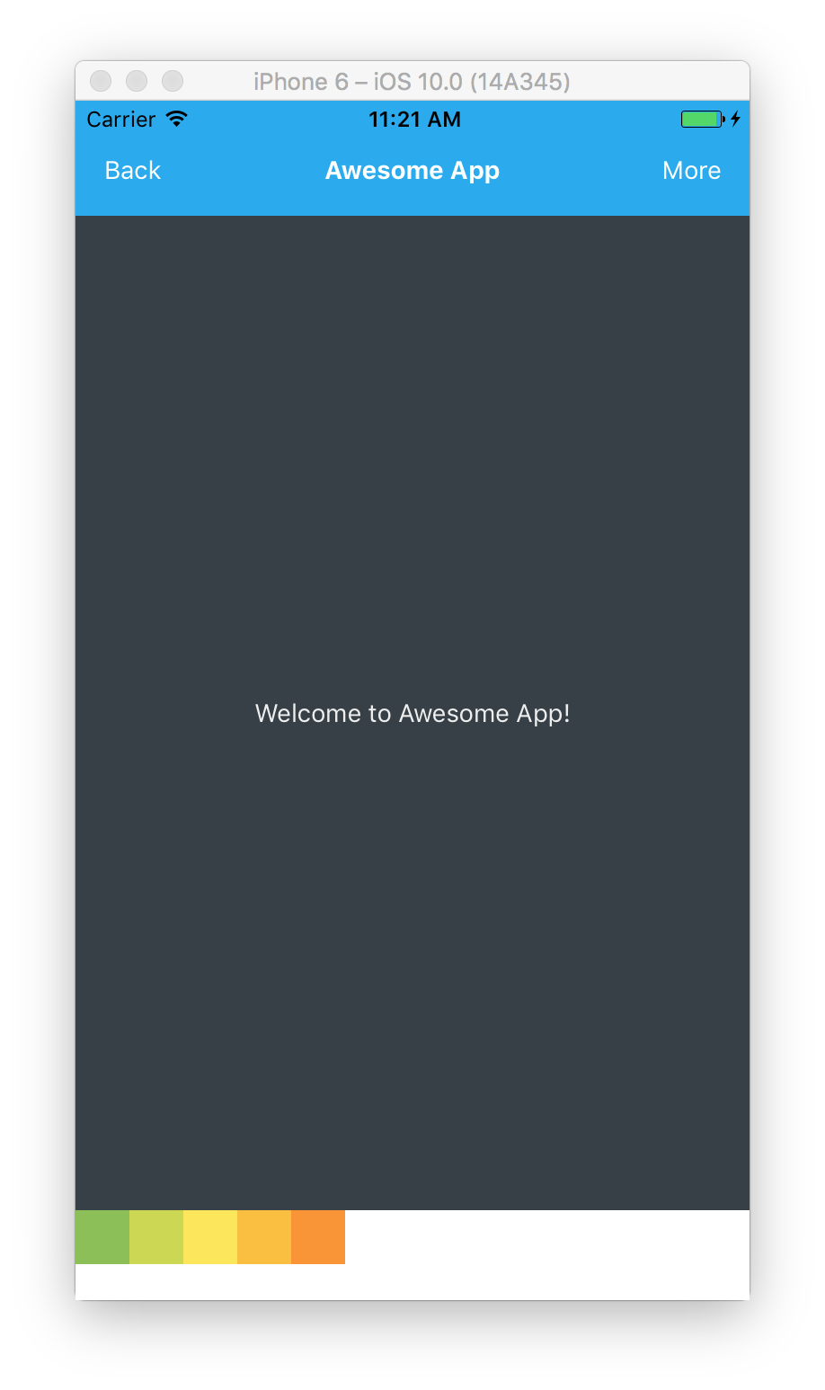
Let’s change tabBarButton to have fixed weight and height instead of being flexible.
  tabBarButton: {
    width: 30,
    height: 30
  },
Primary and Secondary Axis
In flexDirection default column mode the primary axis is column, the secondary is row, and vice versa in row mode.
Justify Content
Adding justifyContent to a component’s style sets the distribution of children along the primary axis. Available options are
flex-start (default) — Children distributed at the start.

tabBar: {
  flexDirection: 'row',
  justifyContent: 'flex-start'
}
center — Children are centered.

tabBar: {
  flexDirection: 'row',
  justifyContent: 'center'
}
flex-end — Children distributed at the end.

tabBar: {
  flexDirection: 'row',
  justifyContent: 'flex-end'
},
space-around — Children distributed with equal space around them.

tabBar: {
  flexDirection: 'row',
  justifyContent: 'space-around'
}
space-between — Children distributed evenly.

tabBar: {
  flexDirection: 'row',
  justifyContent: 'space-between'
}
Align Items
Adding alignItems to a component’s style sets the alignment of children along the secondary axis. Available options are
flex-start — Children aligned at the start.

tabBar: {
  flexDirection: 'row',
  justifyContent: 'space-between',
  alignItems: 'flex-start'
}
center — Children aligned at the center.

tabBar: {
  flexDirection: 'row',
  justifyContent: 'space-between',
  alignItems: 'center'
}
flex-end — Children aligned at the end.

tabBar: {
  flexDirection: 'row',
  justifyContent: 'space-between',
  alignItems: 'flex-end'
}
stretch (default) — Children stretched to fill up all space. This options doesn’t work for children with fixed dimension along the secondary axis.
Conclusion
Flexbox is very powerful tool for creating any kind of responsive layouts for your apps. Keep in mind that default flex direction is column and do not forget to change it to row when you need to arrange children horizontally.
I hope you enjoyed the tutorial. Subscribe to find out about new tutorials and learn how to build amazing apps!